
The Pantone Color Institute has just unveiled what, according to design and trends experts, will be the color of the year 2022.
It is called Very Peri: it is a shade of periwinkle blue with a red-violaceous undertone that looks towards indigo, the color of trust in one's own ideas, inventiveness and personal creativity.
The expression of the cultural trend of our era
We are going through one of the most transformative moments in the history of modern man, full of opportunities, but also of contradictions.
In fact, on the one hand, we are increasingly interconnected with millions of other individuals, overcoming barriers of space, time and language that until recently we considered insurmountable.
On the other hand, we are about to emerge from a long period of physical and mental isolation, which has profoundly modified our way of conceiving our relationship with ourselves, other people and the environment.
Currently, our physical and virtual lives find new ways of merging every day, and the Pantone Very Peri wants to be the chromatic expression of the cultural trend of our era, and the transition we are going through.
A colour conceived and realized just for 2022
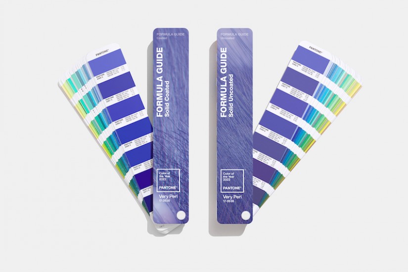
The Very Peri (Pantone 17-3938) is a color that will be remembered in the history of design.
In fact, for the first time since the institution of Color of The Year, for 2022 the Pantone Color Institute has created a new color, instead of choosing one from its palette.
This initiative, like the choice of the couple Ultimate Grey and Illuminating yellow for 2021, comes mainly from the desire to overcome the pandemic, and the feeling of deep uncertainty that has derived.
Read also: The five trendy colors of 2021
In addition, the decision to create a new color for 2022, is the most appropriate expression of the Color Institute to the spirit of change increasingly widespread throughout the world.
A combination of security and desire for action
The Very Peri is one of the variants of periwinkle blue, warmed by a red-purple undertone.
This wise and courageous mix, manages to combine the sense of security, trust and stability typical of blue, with the energy, desire for action and open-mindness to innovation of red.
Overall, it wants to evoke the blue light of smartphone touchscreens.
Every day these tools become an increasingly indispensable extension of our person, and represent the gateway to the virtual world, the place of infinite creative possibilities.
In fact, color has always been one of the most effective forms of communication, and represents the privileged channel of artists, designers and advertisers to express and arouse emotions, ideas, thoughts.
This function plays an increasingly important role in virtual communities, as it enables an increasing number of people to be involved.
The Pantone Color of the Year reflects what is taking place in our global culture, expressing what people are looking for that color can hope to answer.
As we move into a world of unprecedented changes, the selection of Pantone 17-3938 Very Peri brings a novel perspective and vision of the trusted and beloved blue color family.
Encompassing the qualities of the blues, yet at the same time possessing a violet-red undertone, Pantone 17-3938 Very Peri displays a spritely, joyous attitude and dynamic presence that encourages courageous creativity and imaginative expression.
Laurie Pressman, Vice President of the Pantone Color Institute

WE PRODUCE HIGH QUALITY POLYETHYLENE DESIGN ITEMS FOR
INDOOR AND OUTDOOR